A few weeks back I'd noticed that my blog entries printed like crap. Mostly because I have a reMarkable eInk tablet partnered with the Send to reMarkable Chrome Plugin which allows me to quickly print web pages to PDF files I can read on my tablet (great for Commuting, or simply reading long form web articles on the john). I'd tried with a few of my own blog posts, and found that my wonderful blog design wasn't translating very well to print (no surprise, I'd never bothered to generate the print CSS declarations!).
I'll have to fix that, even if only for the few old people (my parents?) who might actually print my web pages...
We already have a bunch of CSS working to reduce browser differences in rendering, in particular, we use the 'normalize' CSS reset as well as the 'skeleton' basic CSS layout as our base layer, then we have our own custom hand-written and tested CSS to produce our header, footer, menus, overall layout and colors. A bit of forewarning, the CSS listed in this blog post is not exactly the same as the print CSS we host online. We've slimmed it down by removing many of the redundant elements, and any copy has been shortened for space. The CSS snippets below are working and can be copied and pasted into your own projects easily, however. Let's get going!
Designing for Laser
If I learned anything from my years as a graphic designer, you should make everything easy to read, with high contrast type on a plain, unadorned background (no colored type on a colored background!) First, we set a global to dump all margins, padding, borders, background images, then set the background to white (like paper!) and the type and links to black (no halftones, no colored fonts, no wasting color prints). You should save as much toner and ink when you're printing, so we'll also remove any decorative box-shadows and text-shadows. Here's our first few lines of CSS, where we set universal colors, as well as link colors and Horizontal Rules display:
* {	margin: 0;
	padding: 0;
	border: 0;
	background: white;
	background-image: none !important;
	color: black;
	@include box-shadow(none);
	@include text-shadow(none); }
a { 	color: black; }
hr { 	border: 4px solid black; }
Lowest Common Fonts
We'll have to get rid of all the fancy fonts we have included - they're not suited for print (only screen), and we're unsure of what character encoding might be supported (US-ASCII?, UTF-8?, UTF-16?). We'll replace everything with this list of 'generic' fonts for most every OS that will be printing. This way, we'll be using native fonts built-into each computer system and can expect good looking printed italic and bold type in our printout.
* {	font-family: -apple-system, BlinkMacSystemFont,
	"Segoe UI", Roboto, Oxygen, Ubuntu,
	Cantarell, "Fira Sans", "Droid Sans",
	"Helvetica Neue", Arial, sans-serif,
	"Apple Color Emoji", "Segoe UI Emoji",
	"Segoe UI Symbol"; }
Type. Set. Match!
I don't have to worry about screen size or resolution or pixels-per-inch anymore - font size is easy on paper! We set the base size here, along with a generous line-height for readability. We'll also set the Headings sizes - nothing too huge, this isn't a tabloid print.
html,
body {font-size: 14px;
	line-height: 1.45em;
	overflow: visible !important;
	width:100% !important; }
h1 {	font-size: 30px;}
h2 {	font-size: 26px;}
h3 {	font-size: 22px;}
h4 {	font-size: 18px;}
h5 {	font-size: 12px;}
h6 {	font-size: 10px;
	text-transform: uppercase;}
The Missing Links
Alas, now the URL's in links are hidden - you can't hover over them to see them, nor can you click on them on paper. We can add them to the printout with this clever CSS snippet. It inserts the URL after the link (with a space included) in a bold italic font that's about 65% smaller than usual (URL's can be long and have no spaces in them).
a::after { content: " " attr(href);
	font-size: 65%;
	font-style: italic;
	font-weight: bold; }
I don't want my newly inserted links in the left column to run into the content in the right column. I'll use this very detailed rule to exclude that from happening. I could also hide it with a overflow: hidden added to the .pullout, but this often includes scroll-bars in your printout, where content is hidden from view poorly.
.pullout a::after { content: none; }
There Be Page Breaks Ahead!
There is no endless scroll in print - only more and more printed pages. We'll have to deal with how content behaves with Page Breaks by making some suggestions in the CSS file which elements can have page breaks before them, and which cannot have page-breaks inside. We'll pick some major elements that logically would discourage breaking already - like headings, images, and tables.
h1,h2,h3,h4,h5,h6,label { break-inside: avoid;
	page-break-after: avoid;
	page-break-inside: avoid; }
p, img, svg { break-inside: auto; overflow: auto; }
blockquote, table, pre { page-break-inside: avoid; }
While we're at it, let's simply hide any blocks of elements that do not add to the content of this page, but rather are decoration or user interface. We'll also remove any forms (un-useable in print). Some of these CSS names are global names, some of these are unique to my project (#ID or .class). If you run Ads on your site, you would include those classes or ID's in this list, as no one likes to print Advertising.
#header, #footer, #alert,
header, footer, aside, nav, movie,
form, iframe, .menu { display: none !important; }
Hidden Messages
Now there's no signifying where this printout has come from (if they've turned off headers), as we've removed many of the design elements that might make it recognizable, like our Header with our Brand and address. We'll be secretly adding some text to the main content element using this CSS. This text will only show up in prints or in PDF saved copies. One line as a header, and another as a footer.
#content::before {content: "From www.undr.com"; }
#content::after {content: "Contents Copyright 2020";}
Show Me The Before/After
Here's links to PDF samples of this very blog post with and without our final Print CSS file. Click each thumbnail to view the PDF File, or simply print this page on your own computer to see similar results!
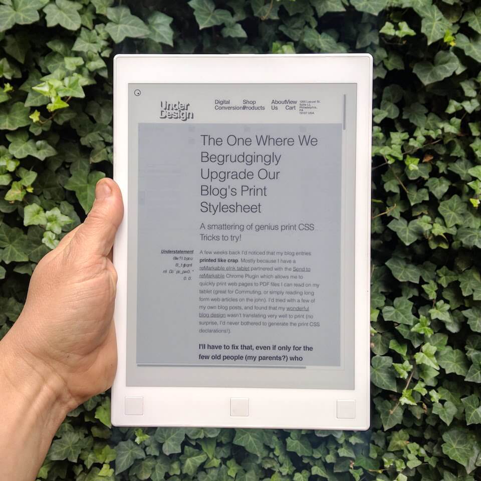
No Print CSS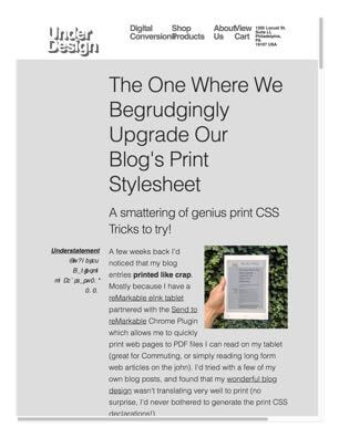
The entire article prints as one page where the type runs off the bottom of the page, the printed scroll bar on the right and bottom signifies it's hiding the content from us. The Italic type turned to gibberish, and the header and background make the entire page look like a waste of ink. |
With Print CSS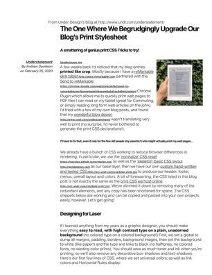
Now it prints as one long, easy to read 5-page article. We maintain our gutters and type justifications. Everything is easy to read and no page breaks happen in the middle of a picture of paragraph. Our hidden messages appear in our print, and the links can be read easily! |
Special Thanks to ShrinkPDF, who compressed my those PDF files above and to my friends at TinyJPG, who easily shaved more than half off my images, making this page load fast!