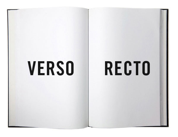
The recto and verso are respectively the “front” and “back” sides of a leaf of paper in a bound item such as a codex, book, broadsheet, or pamphlet. In languages written from left to right (such as English) the recto is the right-hand page and the verso the left-hand page. These are terms of art in the binding, printing, and publishing industries, and can be applied more broadly to any field where physical documents are exchanged. - Wikipedia
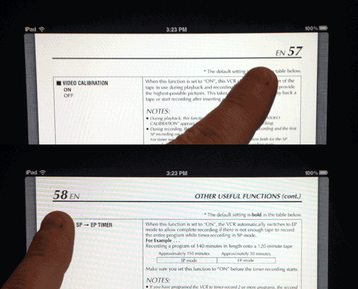
As I was paging through a user manual on my iPad, I was distracted by the page numbers flipping left to right side at the head of the document.

I was reading a magazine on my iPad, and the two-page spread became a single out-of-place illustration (Ad? Pictorial?) with the puzzle answered on the next page when the text began... A two-page spread ruined by the inability to see both pages at once!
Both of these incidents have reminded me of an outdated design practice that has lost it's usefulness and genius with the advent of digital reading devices:
The Death of Recto / Verso
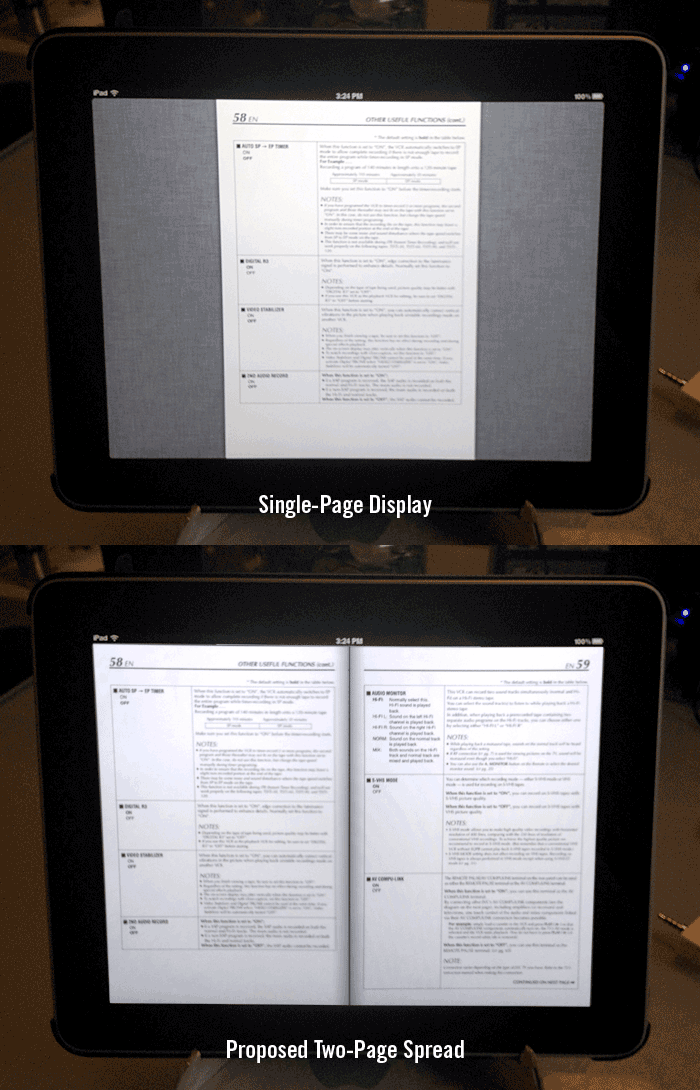
Part of this fault lies with the software I use to read (iBooks) still displaying a single page at any time. Most PDF viewers on consumer devices like tablets and computers do, for that matter. They do it to keep you focused, plus maximizing page size on the low-resolution screens so the text displayed isn't so 'fuzzy'.

They could re-capture the long-lost design with a modified Recto / Verso display (seen above), but this takes up valuable video memory to display two full pages in these devices, which is rare in some low-end devices (poor iPad 1). Plus, with the current resolutions available on many iDevices (1024 x 768), reading a two-page spread would cause for some very tiny pixelated type.
Apple's recent patenting of the 'page-flip' technique might be a hint to the return of two-page spread designs in modern digital design, with Apple's high resolution 300+dpi Retina screens giving your sore eyes a nice sharp view of that once blurry text.
Back In The Day When I Was a Junior Designer...
When I was taught to design long-form print pieces like books or magazines, we used our desktop publishing applications (PageMaker!) to make master pages for the Recto and Verso sides of the page, so that our design was consistent, yet had different gutters depending on the seam or binding. I'd incorporate white space for 'thumb room' on outside gutters, and put page numbers in the lower outside corners for consistency, and easy page flipping with some accuracy.
With the explosion of the internet, and eBooks as a viable distribution channel, where relativly unknown multi-million selling self-publishing authors are doing best by working quickly and delivering crowd-pleasers. Along with the too-low resolution screens on all first-generation tablet consumer devices, might be the nail in the coffin for this outdated practice, especially as print publications are shuttering left and right.
Designers, What Do You Think?
Do you work at a print publication? Really? Still doing print work? Really? Think I'm off base (or my rocker) with this drivel? Still wondering what Recto / Verso means? Leave a comment!